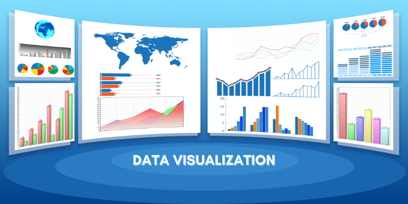
What is Data visualization and Why is It Important?


Data visualization translates information into a visual context, such as a map or graph, to make data easier for the human brain to understand and extract insights. The primary goal of data visualization is to make identifying patterns, trends, and outliers in large data set easier. Information graphics, information visualization, and statistical graphics are all terms that are frequently used interchangeably.
Data visualization is one of the steps in the data science process that states that data must be visualized after it has been collected, processed, and modeled for conclusions to be drawn. This is also part of the larger data presentation architecture (DPA) discipline, which seeks to identify, locate, manipulate, format, and deliver data in the most efficient manner possible.
Data visualization is essential in almost every profession. Teachers can use it to display student test results, computer scientists can use it to advance artificial intelligence (AI), and executives can share information with stakeholders. It is also very important in big data projects. Businesses needed a way to quickly and easily get an overview of their data as they accumulated massive collections of data during the early years of the big data trend. Visualization software was a natural fit.
For similar reasons, visualization is essential in advanced analytics. When a data scientist is developing advanced predictive analytics or machine learning (ML) algorithms, it is critical to visualize the outputs to monitor results and ensure that models perform as expected. This is because visualizations of complex algorithms are generally easier to understand than numerical outputs.
Read more: The Brief Data Entry Outsourcing Guide
Why is data visualization important?
Data visualization is a quick and effective way to communicate information universally through visual data. The practice can also assist businesses in determining which factors influence customer behavior, identifying areas that need to be improved or given more attention, making data more memorable for stakeholders, understanding when and where to place specific products, and forecasting sales volumes.
Other advantages of data visualization include the following:
- the ability to absorb information quickly, improve insights, and make faster decisions;
- a better understanding of the following steps that must be taken to improve the organization;
- an improved ability to maintain the audience’s interest with the information they can understand;
- easy distribution of information, which increases the opportunity to share insights with everyone involved;
- and the elimination of the need for data.
Big data and data visualization
The growing popularity of big data and data analysis projects has increased the importance of visualization more than ever. Businesses increasingly use machine learning to collect massive amounts of data that can be difficult and time-consuming to sort through, comprehend, and explain. Visualization can help accelerate this process and present information to business owners and stakeholders in ways they can understand.
Big data visualization frequently goes beyond traditional visualization techniques such as pie charts, histograms, and corporate graphs. It instead employs more complex visuals, such as heat maps and fever charts. Big data visualization necessitates using robust computer systems to collect raw data, process it, and convert it into graphical representations that humans can use to conclude quickly.
While big data visualization can be beneficial, it can also have several drawbacks for businesses. These are their names:
- A visualization specialist must be hired to get the most out of big data visualization tools. This specialist must identify the best data sets and visualization styles to ensure that organizations make the best use of their data.
- Because big data visualization necessitates powerful computer hardware, efficient storage systems, and even a move to the cloud, IT and management are frequently involved in big data visualization projects.
- Big data visualization can only provide as accurate insights as the data being visualized. As a result, having people and processes in place to govern and control the quality of corporate data, metadata, and data sources is critical.
Data visualization examples
The most common visualization technique in the early days was to use a Microsoft Excel spreadsheet to transform the information into a table, bar graph, or pie chart. While these visualization methods are still widely used, more complex techniques, such as the following, are now available:
- infographics
- bubble clouds
- bullet graphs
- heat maps
- fever charts
- time-series charts
The following are some other popular techniques.
- Line charts. This is one of the most fundamental and widely used techniques. Line graphs show how variables change over time.
- Area charts. Scatter plots are a type of line chart that displays multiple values in a time series – or a sequence of data collected at consecutive, equally spaced points in time.
- Scatter plots. This technique displays the relationship between two variables. A scatter plot forms an x- and y-axis with dots representing data points.
- Treemaps. This method displays nested hierarchical data. Each category’s rectangle size is proportional to its percentage of the total. Treemaps work best when there are multiple categories, and the goal is to compare different parts of a whole.
- Population pyramids. A stacked bar graph is used in this technique to display a population’s complex social narrative. It is most useful when attempting to depict the distribution of a people.
Common data visualization use cases
The following are examples of shared data visualization use cases:
- Marketing and sales. According to Magna research, half of all global advertising dollars will be spent online by 2020. As a result, marketing teams must pay close attention to their web traffic sources and the revenue generated by their web properties. Data visualization makes it simple to see traffic trends due to marketing efforts over time.
- Politics. A geographic map that shows which party each state or district voted for is a common use of data visualization in politics.
- Healthcare. Healthcare professionals frequently use choropleth maps to visualize essential health data. A choropleth map depicts geographical areas or regions that have been color-coded concerning a numeric variable. Professionals can use choropleth maps to see how a variable, such as heart disease mortality rate, varies across specific territories.
- Scientists. Scientific visualization, abbreviated as SciVis, enables scientists and researchers to gain more insight from their experimental data than ever before.
- Finance. When deciding whether to buy or sell an asset, finance professionals must monitor the performance of their investment decisions. Candlestick charts are trading tools that aid finance professionals in analyzing price movements over time by displaying important information such as securities, derivatives, currencies, stocks, bonds, and commodities. Data analysts and finance professionals can detect trends by analyzing how the price has changed over time.
- Logistics. Visualization tools can help shipping companies determine the best global shipping routes.
- Researchers and data scientists. Data scientists typically create visualizations for their use or to present information to a small group of people. The visual representations are made using visualization libraries from the programming languages and tools of choice. Data scientists and researchers frequently use open-source programming languages, such as Python, or proprietary data analysis tools. These data scientists and researchers use data visualization to understand data sets better and identify patterns and trends that would otherwise go unnoticed.
The science of data visualization
Understanding how humans gather and process information is the foundation of data visualization science. Amos Tversky and Daniel Kahn collaborated on research that defined two distinct methods for gathering and processing information.
System 1 is concerned with fast, automatic, and unconscious thought processing. This method is commonly used in everyday life and aids in the following tasks:
- reading the text on a sign;
- solving simple math problems such as 1+1;
- identifying where a sound is coming from;
- riding a bike;
- determining the difference between colors.
System 2 focuses on thought processing that is slow, logical, calculating, and infrequent. This method is used in the following scenarios:
- Reciting a phone number;
- solving complex math problems, such as 132 x 154;
- distinguishing between the meanings of multiple signs standing side by side;
- and comprehending complex social cues
Data visualization tools and vendors
Data visualization tools can be used in a variety of ways. Today, a business intelligence (BI) reporting tool is the most common application. Users can configure visualization tools to generate intuitive dashboards that track and visually interpret company performance across key performance indicators (KPIs).
The generated images may also be interactive, allowing users to manipulate or delve deeper into the data for questioning and analysis. Indicators that alert users when data is updated or when predefined conditions are met can also be included.
To track their initiatives, many business departments use data visualization software. A marketing team, for example, might use the software to track the performance of an email campaign, tracking metrics such as open rate, click-through rate, and conversion rate.
As vendors of data visualization tools expand their functionality, they are increasingly being used as front ends for more sophisticated big data environments. In this context, data visualization software assists data engineers and scientists in keeping track of data sources and performing fundamental exploratory analysis on data sets before or following more detailed advanced analyses.
Microsoft, IBM, SAP, and SAS are market leaders in big data tools. Other vendors provide specialized significant data visualization software with well-known names in this market, including Tableau, Qlik, and Tibco.
While Microsoft Excel remains a popular tool for data visualization, others have emerged that offer more sophisticated capabilities:
- IBM Cognos Analytics
- Qlik Sense and QlikView
- Microsoft Power BI
- Oracle Visual Analyzer
- SAP Lumira
- SAS Visual Analytics
- Tibco Spotfire
- Zoho Analytics
- D3.js
- Jupyter
- MicroStrategy
- Google Charts
Explore our data services now.
