Choosing the Best Data Visualization with PowerBI

I’m sure we’ve all faced the problem of determining the best data visualization for our data sets. The correct data visualization will increase the impact of data storytelling and informed decision-making. Business intelligence platforms for large companies, like PowerBI, help visualize large amounts of data in the best way possible.
What is PowerBI?
Microsoft PowerBI is a powerful business intelligence tool that allows users to create interactive visualizations using business intelligence. The best part is that users can create appealing reports and actionable dashboards without needing external assistance.
PowerBI is not only simple and user-friendly, but it also comes with a plethora of visualization options. Many people appear perplexed when deciding on the best type of chart for their data.
Let’s look at the various charts available in PowerBI to choose the best one.
Types of data visualization charts available in PowerBI
1. Area Chart
Area charts are based on line charts in which the area between the x-axis and the line is colored, patterned, or textured.
The following are the most common applications for area charts:
- To show where a specific trend is likely to go in the future, which aids in planning.
- in determining the magnitude of the trend for each category.
- When you want to show the trend of your data over time without displaying the exact values
However, when dealing with multiple categories, area charts can become overwhelming.
A good example of an area chart is Google’s musical timeline from the 1950s to 2010.
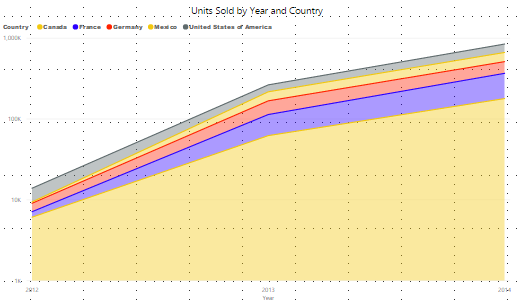
The example below depicts the number of units sold by a company across different geographic regions over two years.
The above chart clearly shows that the number of units sold by a company has been increasing over the last two years.
2. Bar charts
Bar charts are horizontal charts that represent or compare categorical data. They are also capable of representing negative values.
Bar charts are employed.
- To determine the number of unique visitors to a landing page based on country.
- To determine which products are the most popular with customers.
Although bar charts are used to compare data, they cannot be used to study the relationship between those data.
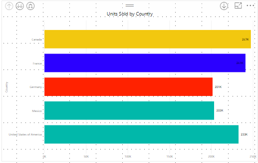
The above graph compares the number of units sold by a company across five countries (Canada, France, Germany, Mexico, and the USA). According to the above chart, Canada has sold the most units, while Germany has sold the fewest.
3. Clustered Column Charts
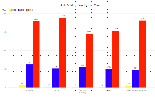
The only difference between clustered column charts and bar charts is that clustered column charts group data from the same category into a cluster. Data within clusters can be compared to data from other clusters, and data from other clusters can be compared to data from other clusters.
For example, each product’s quarterly sales can be grouped. Each product will have four bars, one for each quarter: Q1, Q2, Q3, and Q4. This can assist in determining which product is generating the most revenue and allows you to see how each product’s sales have changed over time.
4. Combo Charts
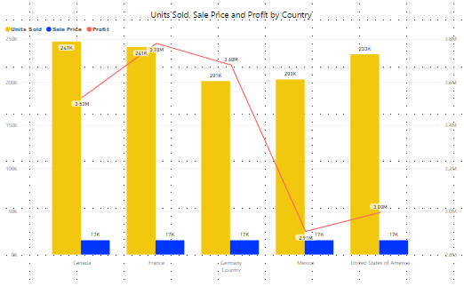
Combo charts as the name implies is a combination of column chart and line chart. Combo charts combine measure values that are normally difficult to combine due to their different scales, such as units sold and revenue.
Combo charts, for example, can be used to compare a company’s actual sales to the budget allocated to achieve sales.
5. Doughnut charts
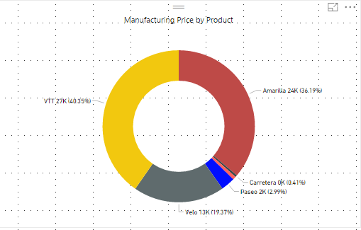
Doughnut charts are named after the shape of a doughnut. They are similar to pie charts in that they can show the proportions of the entire data set. Doughnut charts are handy when displaying the various proportions that make up the final value.
Doughnut charts, for example, can be used to show the percentage of revenue generated per quarter of the fiscal year.
The above chart shows the cost of manufacturing broken down by product.
6. Funnel Charts
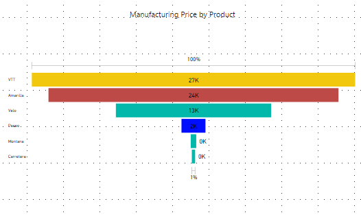
Funnel charts are used to illustrate the steps that lead to a conversion. They are a good choice when the data is sequential, and the first stage has more “items” than the final stage. It is similar to a marketing funnel in that it depicts the stages or steps that convert a non-customer into a customer.
7. Gauge Charts
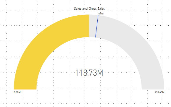
Gauge charts show progress toward a specific goal, i.e., how much of a specific goal has been completed. Gauge charts represent key performance indicators (KPIs), such as a company’s yearly sales goal. The minimum and maximum values are fixed, and the line in the middle shows how far you’ve come toward your goal. Gauge charts are visually appealing but can also take up a lot of space. You should prioritize KPIs over gauge charts if you believe less is more.
8. Line Charts
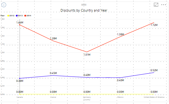
Line charts represent continuous data sets and are a graphical representation of a series of data points all connected by a straight line. Line charts can be used to display the precise value of plotted data. Line charts, for example, can be used to display monthly trends in product sales. There are disagreements about the measurement of time between points. Some believe that data should be measured continuously, while others believe that measuring data at random intervals is adequate. Line charts should only be used for time series or to measure trends, such as dates, months, and years.
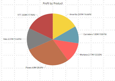
9. Pie Charts
Pie charts are used to show the breakdown of data in sections. A pie chart’s components are represented in percentages, and the sum of all parts should equal 100%. A pie chart’s proportions can be divided into slices. Because pie charts are divided into slices, it can be challenging to identify the sizes just by looking at them. When dealing with categorical data, pie charts come in handy. Ascertain that you have the necessary data to create this type of chart. On the other hand, this chart can only be used with one data set. Pie charts can be used to analyze the percentage of units sold by geographical region, for example.
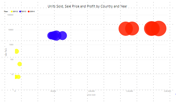
10. Scatter charts
Scatter plots can be used to show the relationship between two variables in a set of data. Data points are plotted along their axis in scatter charts, but unlike line charts, they are not connected by a straight line. Scatter charts can assist in determining whether the correlation is positive (both variables move in the same direction), negative (both variables move in opposite directions), or non-existent (there is no relationship between the variables). Scatter charts, for example, can be used to assess the relationship between an employee’s income and happiness.
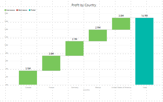
11. Waterfall charts
Waterfall charts can demonstrate how an initial value has been influenced by adding or subtracting subsequent values to arrive at the final value. For example, a waterfall chart can be used to track revenue throughout the year to calculate net profit at the end of the year. Assume you’ve been tasked with forecasting your company’s annual profit. You can add up the various sources of income and then subtract the costs to determine the profit or loss. A waterfall chart can be helpful in this situation.

